| View previous topic :: View next topic |
| Author |
Message |
rollerrider
Joined: 17 May 2003
Posts: 100
|
 Posted: Sat Jan 30, 2016 9:26 pm Post subject: Posted: Sat Jan 30, 2016 9:26 pm Post subject: |
 |
|
| That SUP looks like a surfboard cause its's probably built like a surfboard. Glass on foam with stringers. Should not cost too much.
|
|
| Back to top |
|
 |
outhaul
Joined: 27 Sep 2011
Posts: 254
|
| Posted: Sun Jan 31, 2016 12:48 am Post subject: |
|
|
| Full disclosure, I don't really care what Tower says, just thought It'd be a fun topic. Wow, those Tabou graphics are really out there! My favorite boards looks-wise are those with the sanded paint over carbon, simple yet interesting, form follows function.
|
|
| Back to top |
|
|
beaglebuddy
Joined: 10 Feb 2012
Posts: 1120
|
| Posted: Sun Jan 31, 2016 1:53 am Post subject: |
|
|
| They have a good point, the WS graphics are a bit out there but so what, who cares? Not me. Given the choice I would probably pick the WS graphics over something plain just because it's a bit interesting but I don't care too much either way.
|
|
| Back to top |
|
|
U2U2U2

Joined: 06 Jul 2001
Posts: 5467
Location: Shipsterns Bluff, Tasmania. Colorado
|
| Posted: Sun Jan 31, 2016 9:38 am Post subject: |
|
|
ART
It's been said its in the eye of the beholder. There is a difference in, easy on the eye, and a board full of cross diagonal lines with 60s hippy print in between.
World wide it would be interesting to see what age group they key in.
On Tabou, the Rocket series graphics flow , err, some. I really don't see any segment , all white or crazy wild that sells on that alone.
The naked Mermaid 3S , always reminded me of those naked women outline on mudflaps, usually adorned on a truck. My self I always liked the Yosemity Sam flaps that shot fire from his pistol in conjunction with the turn signal.
Trying to match the areas on some boards is hopeless, unless you have a huge array of tints.
The sanded carbon look is nice. FWIW , just s tail section of spray paint has increased weight by 1/2 pound on several projects
Outhaul, i read now that this wasn't a issue, and I agree it's worth discussion.
But is anyone listening
_________________
K4 fins
4Boards....May the fours be with you
http://www.k4fins.com/fins.html
http://4boards.co.uk/ |
|
| Back to top |
|
|
Arrgh

Joined: 05 May 1998
Posts: 864
Location: Rio
|
| Posted: Sun Jan 31, 2016 11:55 am Post subject: |
|
|
What goes around...
| Description: |
|
| Filesize: |
96.72 KB |
| Viewed: |
9897 Time(s) |

|
|
|
| Back to top |
|
|
nw30

Joined: 21 Dec 2008
Posts: 6485
Location: The eye of the universe, Cen. Cal. coast
|
| Posted: Sun Jan 31, 2016 2:24 pm Post subject: |
|
|
Talking pure graphics, nothing else, as in how they work.
I've always thought that the RRDs have had the worst graphics out there, year, after year, after year, according to the beholder of this eye.
Lately they have been on a psychedelic vomit theme. But truth be told, I'd take the psychedelic vomit theme over the fake logo theme that they used back in 2000, those were even worse. I think they were trying to capitalize on the popularity of stickers, any stickers. They didn't want to be sued by any real manufactures, so they came up with fake ones, pure ugliness (IMO). But the boards worked pretty well.
| Description: |
|
| Filesize: |
274.8 KB |
| Viewed: |
9882 Time(s) |

|
|
|
| Back to top |
|
|
isobars
Joined: 12 Dec 1999
Posts: 20935
|
| Posted: Sun Jan 31, 2016 3:13 pm Post subject: |
|
|
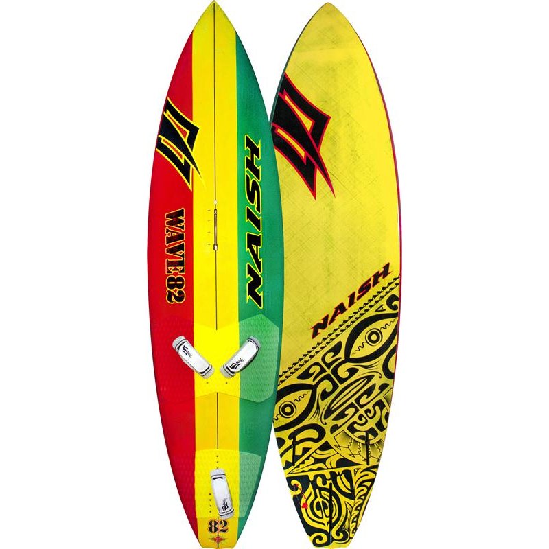
In MY eye are two polar-opposite designs on the same board just a year apart. The best-looking factory board I've ever seen was the 2014 Naish Wave.
Among the lamest, and most boring, was the 2015 Naish Wave, at least on top.
WTF? Reports are that Robby concurred, more or less.
2014 -- its finish looked a centimeter deep.

vs
2015 -- can you say "paint brush"?
|
|
| Back to top |
|
|
outhaul
Joined: 27 Sep 2011
Posts: 254
|
| Posted: Mon Feb 01, 2016 11:22 am Post subject: |
|
|
| The RRD photo posted by NW30 is really amazing, the "graphics" are amazingly bad. The fruit chew "sticker" was really on the board from the factory or am I not understanding this?
|
|
| Back to top |
|
|
U2U2U2
Joined: 06 Jul 2001
Posts: 5467
Location: Shipsterns Bluff, Tasmania. Colorado
|
| Posted: Mon Feb 01, 2016 11:42 am Post subject: |
|
|
| outhaul wrote: | | The RRD photo posted by NW30 is really amazing, the "graphics" are amazingly bad. The fruit chew "sticker" was really on the board from the factory or am I not understanding this? |
What interest me more is the smashed side just above the Sticker
Their are some strange numbers as well, perhaps a promo or used in a advertisement .
I had RRD 135 Avant ...move I think it was called, around 2002, it was nice and sound, construction was adequate , but not strong.
_________________
K4 fins
4Boards....May the fours be with you
http://www.k4fins.com/fins.html
http://4boards.co.uk/ |
|
| Back to top |
|
|
Arrgh
Joined: 05 May 1998
Posts: 864
Location: Rio
|
| Posted: Mon Feb 01, 2016 5:56 pm Post subject: |
|
|
And then there's the board from this direction. I think we may have a winner.
| Description: |
|
| Filesize: |
279.44 KB |
| Viewed: |
9746 Time(s) |

|
|
|
| Back to top |
|
|
|
|
You cannot post new topics in this forum
You cannot reply to topics in this forum
You cannot edit your posts in this forum
You cannot delete your posts in this forum
You cannot vote in polls in this forum
You can attach files in this forum
You can download files in this forum
|
|
|

